
You all are incredibly sweet and stuff, but I need some help. I would like to make my blog easier to look at, more user friendly and....well just better. I know you all will have different opinions on colour, and design but if I see a trend it would be good to look into that.
I want you to rate me, not really a number...but tell me what you like and what you don't about my blog. I promise that if you are gentle I won't cry!
I will tell you what I would like to do with my blog and you can tell me if I am headed in that direction. I would like to have it be a place where, as much as well all love intelligent book reviews done by professor types, I write in a more human apporoach about the books I am reading. As far as the look goes, I would like it to look slightly professional-ish...but really I am not clean cut and I can't expect that my blog will be.
So click away....do my links take you where you thought they would?? Is my header offensive? (haha, let's hope not!) Did you like it better in my puke green?
bust it out peeps! :)


8 comments:
I love your header and the colors of your blog. I have to be honest, because I read ALL posts in google reader (the black and white and standard font is easier for me), I don't notice links or colors as often. Only when I'm discovering a new blog do I browse around a little more--and even then not really because I don't have the time. Not much help--or maybe...?
Your new design is great! I always like it when people put a picture of themselves on their blog, but that's just me.
I like the tabs, and everything is easy to find.
I really like your current theme more. I tend to be biased towards layouts with white or faint colors, it really makes it easier to read.
I love the pictures you post on your blog and the recipes too.
thanks folks!
trish- Yeah, I know that most of the time I read blogs in reader too. But when you do come, I want things to be easy to find.
Alyce- Yes, I need to do that. Thanks!
violetcrush- yeah, I don't have a hard time with reading in colour, but I know many people don't really enjoy it. I will keep it in mind that you all seem to like the lighter/white colours :)
Thanks to all of you for your thoughts for me!!! :)
I'm glad that green is gone! The new layout is much easier on the eyes.
Some minor things:
- I find the italics on your page navigation buttons quite hard to read (especially when they turn dark blue!). But I usually have a lot of trouble with italics anyway, so take that as you will...
- You could probably put the "bookie links" section on the other side, for more balanced sidebars in terms of length.
That's all!
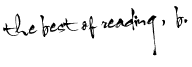
I really, really like your new header, Bethany. I think it's very elegant. With that said, please do not stop posting pictures of yourself during read-a-thons. I would miss them.
I just discovered your blog and I really really love it.. your posts have a personal touch.. I'll be visiting often. :)
Sorry I never responded but I've been without internet for a few weeks. I love the layout of your blog, very easy to read. I do read it in google reader but click over whenever I comment so I see your blog when I comment.
Post a Comment